Tomas Fürst
Novozélandská data
Před několika týdny oblétla internetovým podpalubím zpráva, že jakýsi ajťák na Novém Zélandu vynesl velký balík dat o covidovém očkování, který prý jasně dokazuje, že očkování zabíjí. Steve Kirsch kolem toho nadělal tolik řečí, že mu zřejmě místní přátelé svobody slova zablokovali stránky, protože se k nim z USA nemůžu dostat a musím prosit kamarády na východě, aby mi to stáhli a poslali.
Objevil se komentář na Voice of Freedom, článek Igora Chudova a rozbor Normana Fentona. Tak mi to nedalo a podíval jsem se sám, co uniklá novozélandská data říkají. Je v nich napsaná velmi vzrušující detektivka, kterou jsem pojednal rovnou anglicky, ať to nemusím dělat dvakrát. Výsledek jest zavěšen na stránkách SMIS a já se pomalu smiřuju s tím, že krom covid fašistů – kteří už mě nenávidí dlouho – mě začnou nenávidět i zarytí odpůrci covidových vakcín😊Udělejte si kafe a pusťte se do čtení. Je to dlouhý a složitý.
Data Acquisition. I downloaded the file “nz-record-level-data-4M-records.csv” from Steve Kirsch’s web site. The file size is 284,925,416 Bytes. The data can be downloaded here:
https://kirschsubstack.com/p/data-from-us-medicare-and-the-new
Unfortunately, I have no knowledge of the mechanism of the data origin.
Data Overview. The file contains the following header:
mrn, batch_id, dose_number, date_time_of_service, date_of_death, vaccine_name, date_of_birth, age
The “mrn” field contains 4,193,438 numbers from 0 to 2,215,728. These are identifiers of the patients, we thus have approx. 2.2 million people, about 43% of the NZ population (i.e. certainly more than half of the vaccinated NZ population).
The “batch_id” field contains 125 unique batch identifiers (1, 2, … 125) with the following distribution:
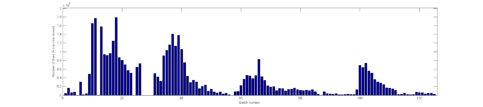
Figure 1. The distribution of the batch sizes in the NZ data set.
This looks credible, the batch sizes and their distribution matches expectation.
The “dose” field contains numbers 1, 2, … with the following distribution:
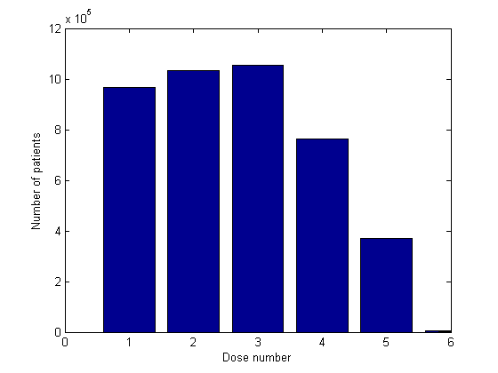
Figure 2. The distribution of dose numbers in the NZ data set.
Further, there are 6,633 people with dose 6, 76 people with dose 7, 20 people with dose 8, and several people with doses 9 and beyond, all the way to dose 26. Doses above 5 are not shown in Figure 2. There are 11 people with dose higher than 10, which is probably a mistake. The distribution of the dose number suggests that the data is not representative. One would expect more doses 1 and 2 than doses 3 which is not the case. This is an important point.
The “date_time_of_service” field contains dates from 08-Apr-2021 to 20-Oct-2023. These dates probably correspond to the day of the administration of the vaccine. Let us plot the daily number of doses from 01-May-2021 to 31-Dec-2022 and compare with the data from Our World in Data (the data from OWD for NZ do not go beyond 31-Dec-2022).
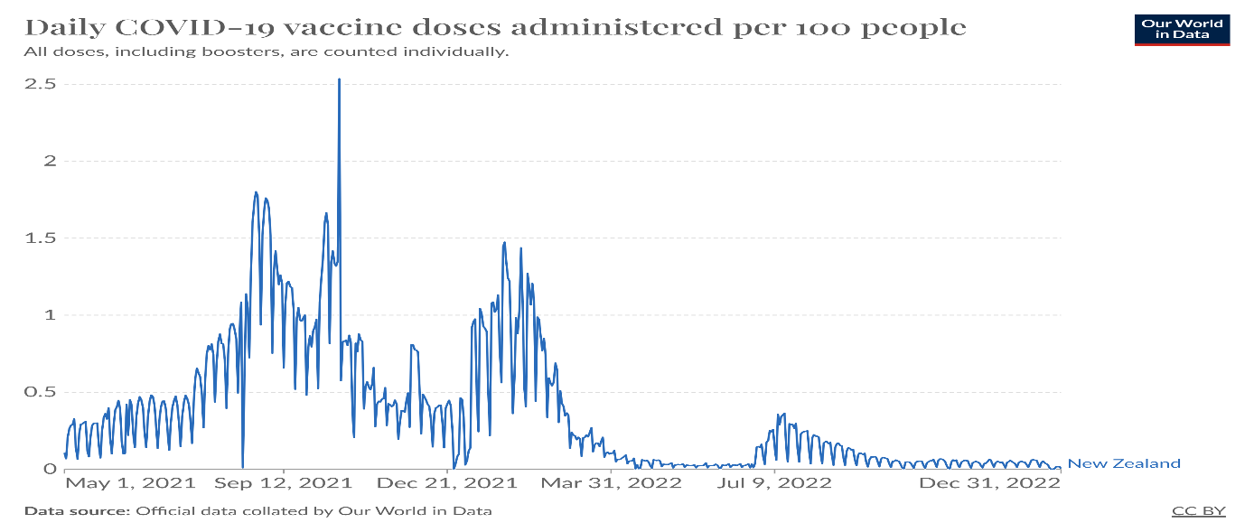
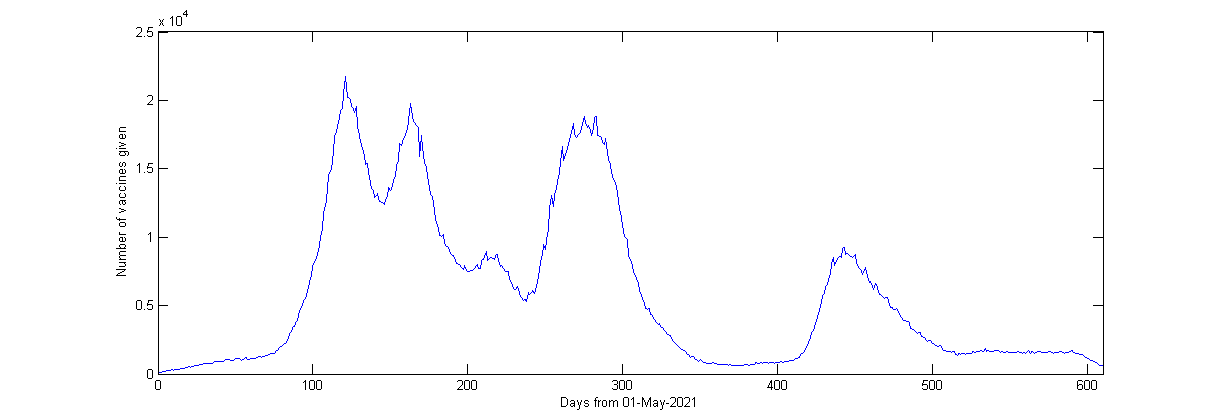
Figure 3. The number of vaccines administered each day in the NZ data.
The correspondence is not bad at all. Vaccines given in 2022 seem to be over-represented in the set. This is consistent with the over-representation of doses 3 (cited above). A weekly period is not visible in the leaked data (unlike the OWD data). This requires explanation.
The “date_of_death” field contains the date of death for 37,315 people. The earliest date of death is 09-May-2021, the latest 27-Oct-2023. In 2021, there were approx. 35,000 deaths in NZ, in 2022 the number was 38,500 deaths. So, the NZ file contains less than half of all the deaths in NZ in the covered period. That roughly agrees with the number of people in the dataset. This is evidence that the data is probably not too biased.
I did not analyze the “vaccine_name” field, it’s mostly Pfizer.
I do not read the date of birth field, as we have the age in the following field.
The “age” field contains ages from 1 to 114 with the following distribution:
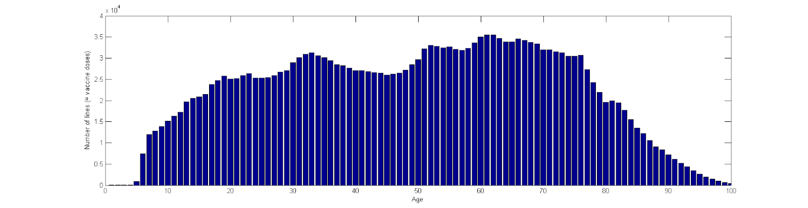
Figure 4. The age distribution of the entire cohort in the NZ data set.
There is no way of telling how representative this is of the vaccinated population. But the data is obviously NOT restricted to specific age cohorts. The population structure of NZ is here (wiki):
Interim assessment. The data is almost certainly genuine. They comprise approx. half of the NZ vaccinated population. It is unclear to me how the half was selected. Third (and possibly fourth) doses seem to be over-represented (i.e. first and second are under-represented). The date of vaccine administration agrees well with OWD data on the course of vaccination in NZ, but strangely lacks weekly periodicity. The age structure does not seem unrepresentative of the vaccinated cohort, i.e. there is no obvious selection bias with respect to age.
Data Analysis. Since we have no idea how the cohort was selected, there is not much we can do. The fraction of deceased in each batch will generally depend on
- the batch itself,
- the age and frailty of the cohort vaccinated with the batch,
- the length of follow-up, which in turn depends (among other things) on the dates of administration of the batch.
Let us see if the data exhibit the expected dependencies.
Batch number and time of application. First, let us notice that the batches are numbered very consistently with the time of their application. In the following graph (Figure 5), the horizontal axis shows the batch number, and the vertical shows the median of the dates of application of the batch. Time is measured in days from 1.1.2021.
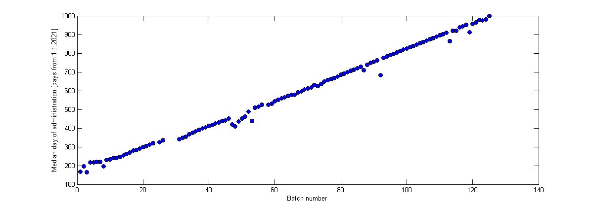
Figure 5. Median day of administration of individual vaccine batches. The numbering of the batches well corresponds with the time of their administration.
We thus must understand that the batch number influences the length of the follow-up of the people who received it.
Batch number and age of recipients. Next, let us show the age distribution of the batch recipients. The horizontal axis shows individual batches. The vertical axis shows the age of the batch recipients. The black dot is the median age, thick blue lines extend from 25% quantile to 75% quantile, the shorter horizontal lines are blended dots for outliers.
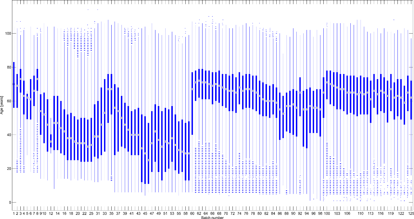
Figure 6. Age distribution of the recipients of the individual batches
Several observations in Figure 6:
- At the beginning (left), vaccines were given to older people, so the median age decreases between batches 1–15.
- The hump around batch 30 corresponds to the onset of dose 3 (given at first to older people). The increase between batches 59 and 60 represents onset of dose 4. The increase between batches 98 and 100 represents the onset of doses 5. These observations are confirmed by the contingency table of doses vs. batch numbers (not shown).
- The variability of age in each batch category is very large. This suggests that each batch was administered to very diverse population – i.e. there were no batches “reserved” for the old, or for children, …
Number of deaths and batch numbers. Each death in the dataset was assigned to the batch of the last dose that the deceased individual obtained. It is not informative to compute the fraction of deceased in each batch because the batches differ in age structure, and especially in the follow-up period. For example, people who received the early batches as dose 1 went on to receive dose 2 quite soon. So, the follow-up for the early batches may be very short. Thus, we must proceed correctly and compute the number of deaths in each batch per the total number of person-years spent in each batch.
For each patient, we collect all the dates of all the doses that are available in the data. For example, patient 13 received dose 1 on day 129, dose 2 on day 150, dose 3 on day 340, then received dose 4 but we have no record of that, and then received dose 5 on day 885. (Days are numbered from 1.1.2021). This patient is 91 years old and either did not die before the end of the follow-up period, or we do not have record of his/her death. For each patient, we want to compute the number of days spent on a particular batch. Then, for each batch, we can compute the number of deaths on this batch per the total number of person-years spent on a dose from this batch. This is the only correct way to compare the batches.
This immediately runs into the problem of missing data. E.g. our patient 13 received dose 4 but we have no record on the date of dose 4 administration. We cannot ignore this because we would introduce systematic bias (we would over-estimate the time spent on dose 3). Thus, we will interpolate all the missing data. Any missing dates of doses between doses with known dates will be interpolated linearly (e.g. in the case of patient 13, the missing date of dose 4 will be estimated to be day 612.) This data imputation step should not be omitted, otherwise all inference will be biased due to systematic over-estimation of person-years spent on each batch. Note that we never impute missing data before the first dose of known date, or after the last dose of known date – this necessarily brings some bias into the analysis. Also note that batch numbers are not imputed.
This procedure leads to the imputation of 70,735 dates of doses. Imputation affects approx. 3% of the patients. In 717 cases, the patient with an imputed data point died. This represents approx. 2% of the deceased patients.
For each batch, we computed the batch-specific death rate by dividing A/B, where A is the number of deceased who received a vaccine from this batch as their last (known) dose, and B is the total number of person-years spent by all people on a dose from this batch.
Let us show how this batch-specific death rate (BSDR) correlates with other batch characteristics. First, we plot the BSDR against the mean age of the batch recipients.
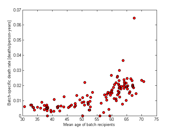
Figure 7. Batch-specific death rate with respect to mean age of the batch recipients. Each dot represents a single batch.
There is nothing unusual in Figure 7. The BSDR seems to increase with the age of the recipients. The absolute values are reasonably close to 1% for batch recipients of mean age around 40 which corresponds well with the background death rate of the overall population (mean age of NZ population is approx. 37 years). Cohorts of higher age have a higher death rate. The only outlier corresponds to the very first batch, which was probably given to the frailest population.
As a sanity check, we plot the BSDR against the time of administration and color by median age of recipients.
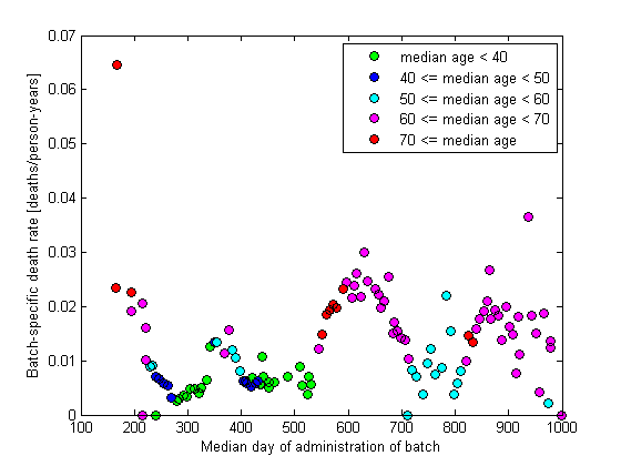
Figure 8. Batch-specific death rate with respect to median date of administration of the batch. Each dot represents a single batch. Median ages of the batch recipients are color coded.
There is nothing unusual in Figure 8. The waves in the graph correspond to doses 1, 2, 3, … In case of each dose, the oldest population was vaccinated first.
Finally, it may be interesting to see the BSDR dependence on batch size. We would expect that smaller batches will exhibit larger variability of BSDR, which is exactly what we get:
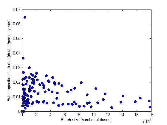
Figure 9. Batch-specific death rate with respect to the size of the batch. Each dot represents a single batch.
Conclusion. Although I do not know the data generating mechanism, I do not doubt that the data are genuine and describe a non-representative sample of approx. half of the vaccinated population of New Zealand. I do not find any evidence of vaccine associated mortality in the data. Nothing in the data points to an unusual pattern of inter-batch variability.